Weather Visualization
Improved data visualizations and flexible map styling for weather organizations
Role: Product Design Lead
Timeline: 4 months
Product: Mapbox Studio
Blog: Mapbox Blog Post
Motivation
As part of a strategic effort to better support and land more weather customers, Mapbox built out a new data pipeline to support complex weather data formats like GRIB — a standard in the meteorology world for visualizing things like temperature, wind, and precipitation patterns.
Solution
My role was to design support for this new format in Studio, our online map editing and creation tool.
As the only user-facing product tool for a developer platform, the Studio team often received requests from other teams asking to “just build in the UI for X feature”. This usually was not as simple as it seemed, and this project was a good example of the work that I put in as the lead designer on the team to get clarity, drive alignment, and ship intentionally built and thoughtfully executed improvements.
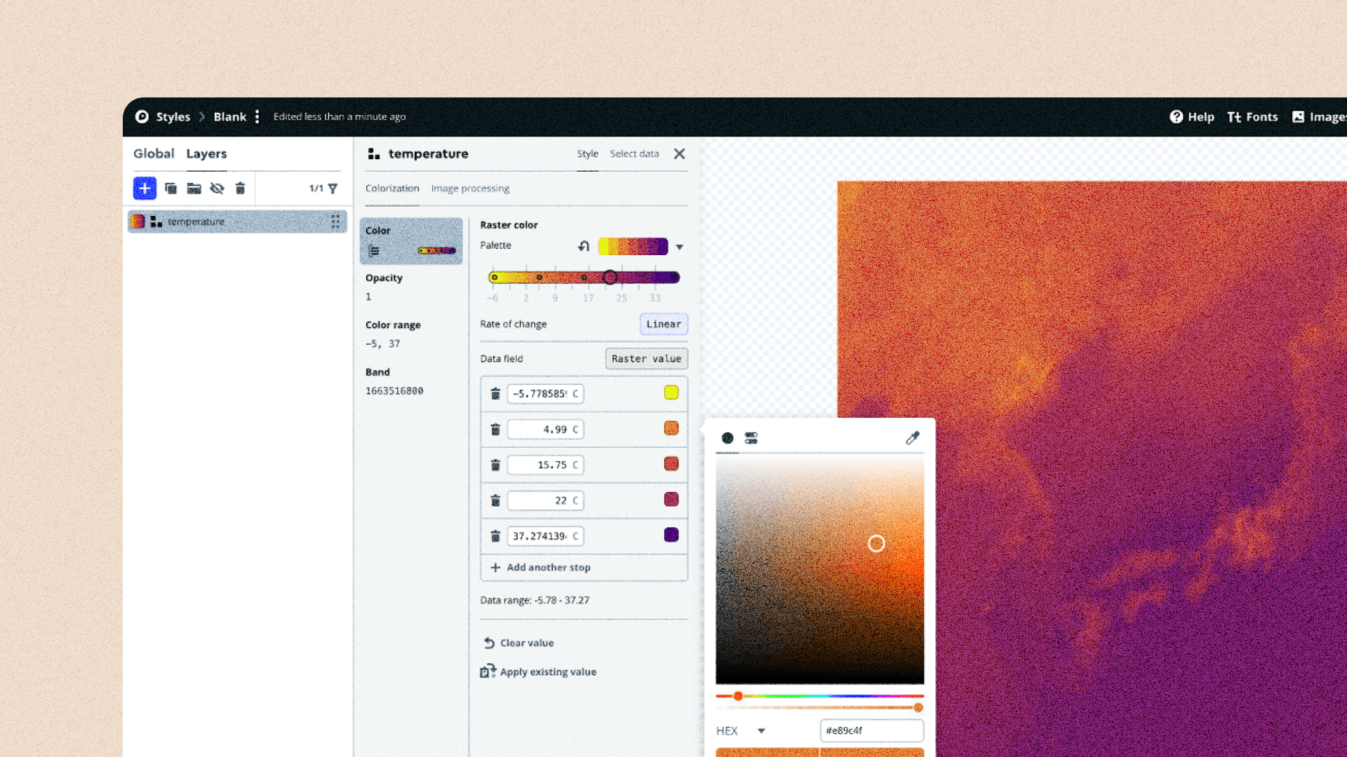
Raster colorization for weather maps
Some highlights of what we shipped…
Apply pre-built or bespoke color palettes
Once users had uploaded their data, we learned that it was important to quickly be able to apply some rough styling. While I had assumed that users would care most about bespoke brand colors, we learned through testing that they preferred to define their colors later in code. They mostly wanted to use Studio to preview and quickly validate that their data was showing up as expected.

Quickly view and visually debug weather data
Previously customers needed to use 3rd party tools like QGIS and command line tools to even be able to view the contents of their weather files. Now, if customers processed their files through Raster MTS, they could easily view the different layers (or bands) of this data in Studio. The bands usually represented different views of the same data, such as the temperature at 6-hour intervals.

Modernize UI
I modernized the color range UI as part of this work. The subtle changes made for a cleaner user experience across all layers that used a color range component.

Before, users had to open a popover to edit the data value. The new design exposed this input directly making it much quicker to test and preview different values. By separating the color swatch preview from this input we also made it possible to directly edit the color and delete the color stop.
The challenge
There was already a feature in Studio called “raster” data, but this new weather data was a totally different kind of raster. The design problem wasn’t just about adding a new input or visual style — it was about making sure this new data type felt like a first-class part of the product, without confusing people or breaking existing workflows.
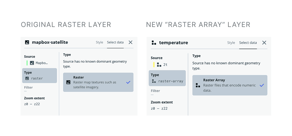
The previous raster layer was treated like an image, and this metaphor extended as far as the icons we chose for that layer type. With this new type we chose a stack of blocks to indicate that you could edit the colors of this “image” pixel by pixel, or more technically, by encoding values to the array of pixel colors.
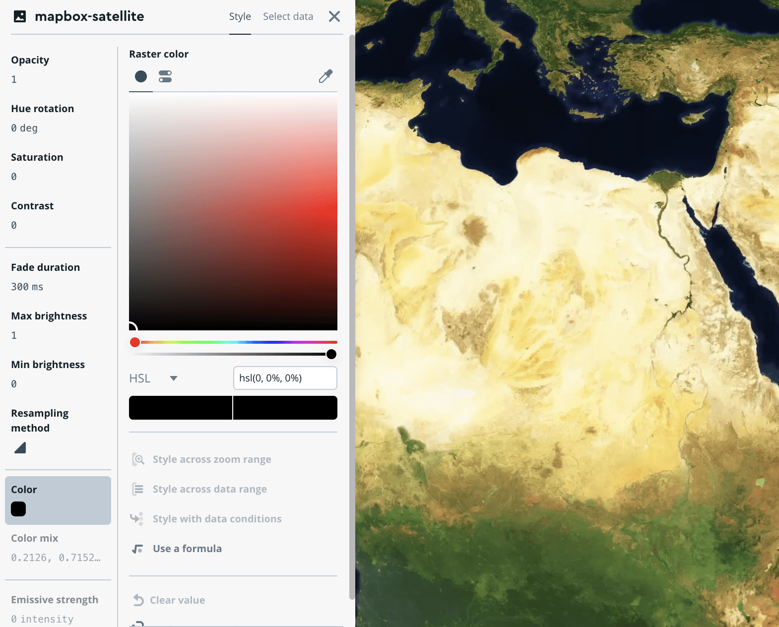
Traditional image raster layers have all the layer properties in one tab because they could all be valuable.
Many of the properties of traditional raster layers would still be available for the new Raster Array type. My early designs combined all these new properties into a single layer. But after deep-diving into the technical details with the engineer, we came to the conclusion that these properties were not really the ones end-users would care about for this new layer type. So we opted to nest these “image-processing”-like controls into a second tab to make the default experience focus on what we knew users cared about.

My process
This project lived in the space between two teams: the Weather API team, who were building out the technical support for the data, and the Studio team, who owned the user-facing UI. My job was to make sure the design made sense for both the product and the customer.
Long whiteboarding sessions with engineering
I started by meeting 1:1 with the lead engineer and asking a million questions — I needed to understand exactly what was being built and what constraints I had to work with. These are some of my favorite types of collaboration. We had a fun white-boarding session where I not only got clarity but gave him new areas to ponder and follow-up on.
Usability testing and feedback
Once I had a clear picture, I worked closely with both the Studio and Weather PMs to line up customer conversations. Because the feature was still in alpha, we kept the feedback loop tight: two weather engineers from newsrooms, and one internal support engineer who regularly built weather-based demos.
User insights and future roadmap items
I ran two rounds of interviews with these folks, combining usability testing with open-ended discovery. These conversations uncovered that even though we were making progress by supporting this new file type, customers still had to process and upload these files via the CLI. They assumed, rightly so, that this would be handled directly in Studio, but I knew from internal discussions that we didn’t have the technical capability to support this yet. So I shared this feedback back to the Weather team so their PM could use this as data to support including this work in future roadmaps.
Launch
Once we’d launched we noticed that while the feature was well received, it was hard to discover or even demo. During stand-up one engineer brought up that it would be helpful to have demo datasets to make this easier to explore. I thought this was a great idea so we cut a ticket that would capture this idea and hopefully be picked up down the line, and this ended up shipping at some point after I left the company.

Global raster datasets such as Wind maps, temperature, and dewpoint temperature were added as sample datasets. These are available when a new layer is being created in Studio, making it easier to play with the feature.
Takeaways
Building relationships for collaboration
This project was a good reminder that even “simple” projects can grow. A big part of my role as a designer is asking the questions nobody else is asking — the ones that seem obvious, but often aren’t. Taking the time to sit down with engineers early on not only helped me design something that made sense, but also built trust, so when technical decisions came up later, they looped me in so we could think through it together.
Improving processes
I also felt that this project was also a bit trickier than it needed to be which I flagged to my team. During retro we identified that part of the issue was that because we had assumed the project would be “low-lift” we didn’t bring in a lead engineer from the Studio side early enough. Which meant that for a while I had to play the role of telephone between the Weather eng team and the Studio eng team; we decided on a process improvement from then on that would make it a standard practice to loop in a dev from the Studio side even if we thought the project was straightforward, this would shorten the feedback loop and lead to even better collaboration.